Paperclip City: KCQ investigates Kansas City’s municipal seals
A reader recently came across a Twitter post showing the evolution of Kansas City’s municipal seal over time. Two of the three emblems seemed self-explanatory, but one, a red and blue geometric design didn’t seem to have much to do with Kansas City at all.
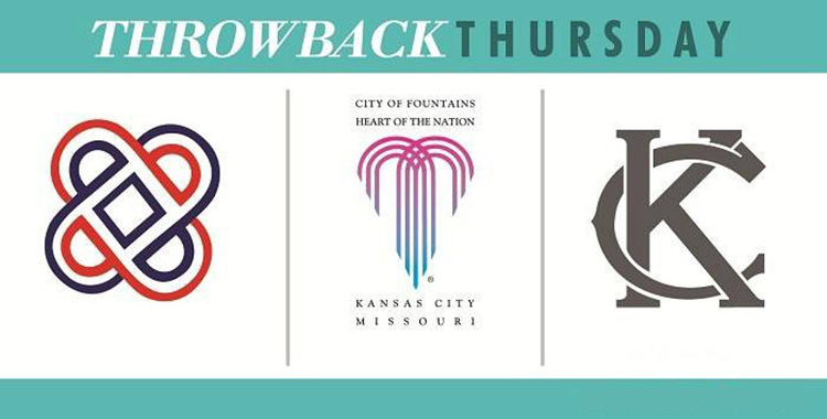
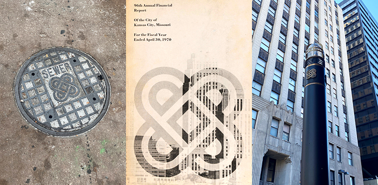
The reader recalled encountering the design on old city documents, and on bits of infrastructure around town. The reader asked What’s Your KCQ?, a collaboration between The Star and the Kansas City Public Library, to investigate the evolution of Kansas City’s seal.
First, the curious looking symbol was not the first to represent Kansas City. In 1855, the city council defined the seal as “a circular stamp in the center of which shall be an illuminated shield embellished with stars and stripes, and around it engraved the words Seal of the City of Kansas, Jackson County, Missouri.” Later, the City of Kansas renamed itself Kansas City when a new charter was passed in 1889, and altered the seal to reflect the change.
In 1944, a city auditor noticed that no action had been taken by the council to make the altered seal official. He recommended that a new ordinance describing the change be drawn up and put to a vote. But still, no action was taken, and the unofficial seal stayed in use.
What finally spurred the city to act, was a surge of phone automobile license stickers. Councilmembers realized that an official municipal seal on the stickers would elevate act of counterfeiting from a misdemeanor to a felony. The city made the seal official in 1952.

In 1958, after the city had grown into counties north of the Missouri River, the words “Jackson County” were removed.
By the 1960s, the era of urban renewal was in full swing, and city leaders had municipal reinvention on their brains. Kansas City Mayor Ilus W. Davis called for a redesign of the seal in 1965. The Municipal Art Commission suggested that the project would be the perfect assignment for the Kansas City Art Institute’s design department.

KCAI sent eight drawings which all touched on Kansas City’s heart of America identity. However, Davis wanted the confluence of the Kansas and Missouri rivers worked into the design and was not pleased with what he saw. Rather than ask KCAI for more ideas, the city hired a New York City design firm. Those efforts, too, were rejected.
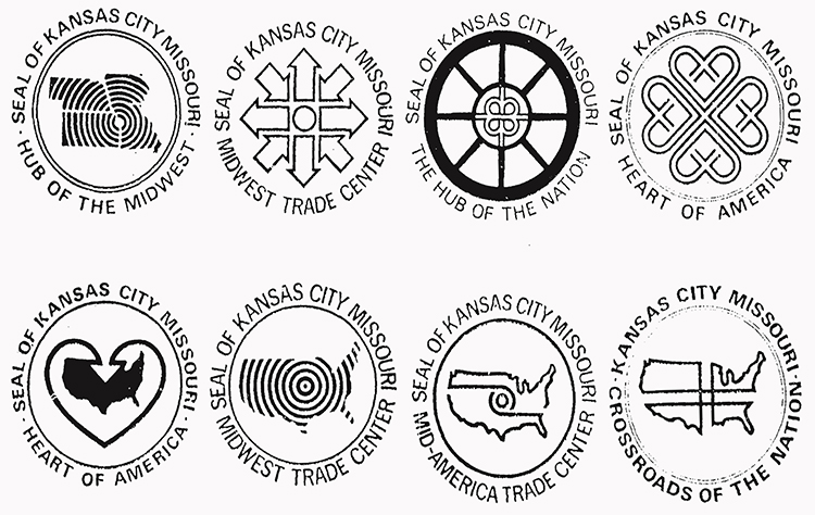
Finally, in 1969, after four years of study and proposals, Davis and the Municipal Art Commission returned to one of the original KCAI designs, but not one of the eight considered in 1967. The design was simpler in its concept, and like many of the others, was inspired by the heart of America theme. Design instructor John Baker created the icon, comprised of four interlocking hearts viewed from any angle.
Reaction to the design was mixed. One council member described it as too “far out.” Others thought it looked like two interlocking racetracks. Some failed to see the hearts. Before the seal was approved, Councilman G. Lawrence Blankinship handed the design to a City Hall elevator operator and offered a cash prize if its meaning could be identified at first glance. The operator could not muster a guess.
Still others saw what would permanently label the design in the minds of many — paperclips. Many Kansas Citians went so far as to quip that no finer emblem of government bureaucracy could be found.

The council was divided, but Baker’s design official became the city seal by a vote of 7 to 5 in 1970, and the new seal began popping up around the city. Despite popular resistance and the fact that the design didn’t represent the confluence of the rivers, Davis remarked in 1969, “The seal has sort of grown on me.” And for some Kansas Citians, the seal had the same effect.
By the 1990s, the paperclip seal had worn out its welcome for some, and, early in his tenure as mayor, Emanuel Cleaver II made known his desire for a replacement.
In 1992, the city went so far as to grant its Special Facilities Department permission to omit the seal from its promotional material. Instead, the department favored an emblem intended to represent modern architecture. And, much like the debate over Baker’s design in the 1960s, some were confused by its meaning. Special Facilities Department Director Wilhemina Boyd remarked of the logo in The Kansas City Star, “I thought it was a hand.”
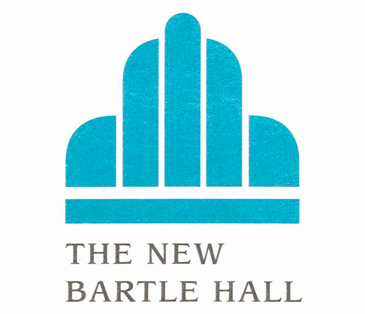
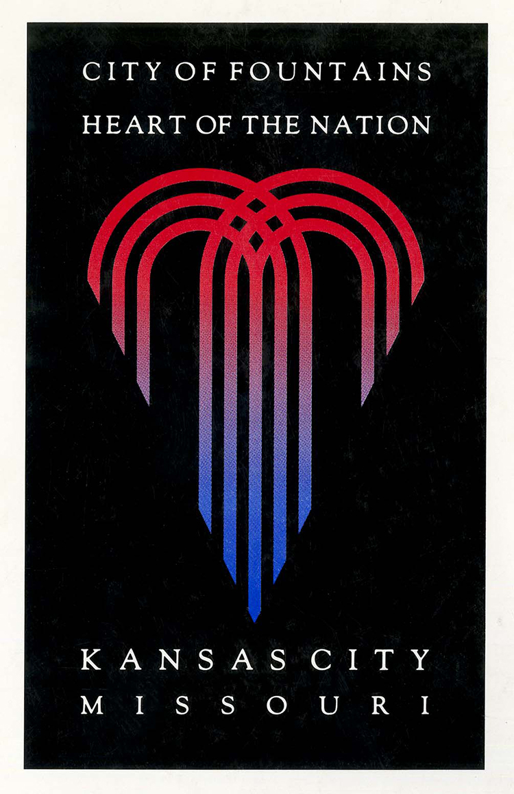
Later that year, the city council unanimously approved a new seal. Designed by Patrice Eilts-Jobe of EAT Advertising and Design, the new seal blended Kansas City’s heart of American and city of fountain identities.
Even with the entire city council on board, public reaction was again mixed. After voting for the new seal, Councilman Ronald E. Finely commented that he thought it resembled a grappling hook and suggested that the heart shape should be filled in to clarify its message.
In a 1992 letter to The Star, David Maslan compared it to spaghetti tossed in the air and criticized the process, asking, “Are we to get a new seal every time we get a new mayor?” He also questioned why KCAI wasn’t involved.
The era of “Paperclip City,” a nickname inspired by Baker’s seal, had come to an end. The 1992 fountain/heart design endures as the city’s official seal today.
Though, in 2013, under the leadership of Mayor Sly James, the city once again felt the urge to rebrand. The official seal would remain in general use, but it was recognized that the fountain/heart graphic didn’t translate well on digital devices. Some other symbol for use in marketing and social media posts was called for.
Emily Elmore of Single Wing Creative took it upon herself to design a new marketing logo for the city — free of charge. Her simple KC design has quickly become iconic of municipal government. And like redesigns of the past, Elmore’s logo has had its critics.
Some claimed it was too simple — too much like a T-shirt graphic. Others thought it too derivative of the old Blues and Monarchs baseball team logos. Elmore didn’t shy away from the accusation. She directly drew from the interlocking Ks and Cs on the team caps. In the spirit of city government, the design is open source, meaning it can freely be used by all — including T-shirt makers.

And as for the logo being too simple – that too was intentional. Not only did it reduce well for display on devices, but it also left no room for misinterpretation. When the KC logo was adopted, Mayor James said, “At the end of the day, you want something that when people look at it, they say ‘Kansas City,’ boom, it jumps right out at them.”
The KC logo has served the city for eight years, but earlier this month, its retirement was announced. In the coming months, a refreshed fountain/heart design with “Kansas City Missouri” in bold font will replace the 2013 design in the city’s branding.
You’ll be seeing it everywhere before long, according to city spokesman Chris Hernandez.

SUBMIT A QUESTION
Do you want to ask a question for a future voting round? Kansas City Star reporters and Kansas City Public Library researchers will investigate the question and explain how we got the answer. Enter it below to get started.


